The previous three activities, often all completed in a single substantial workshop involving quite a large number of participants, have created up to 200 architecturally significant requirements (ASRs), agreed a level of impact for each one, and determined the extent to which up to 15 stakeholders are interested in them. At the end of all this, it would be reasonable to ask the question: Have we got this right?
Given the potential size of the matrix of ASRs by stakeholders, which could have up to 3,000 cells, this is not an easy question to answer. The next tab in the spreadsheet tool, ‘Stakeholder Views’, is intended to help the team do just that. If the previous activity was completed in the workshop, then reviewing this tab could be the closing activity of the workshop. Alternatively, it might be more appropriate for this question to be addressed by the designer / architect in a separate meeting with the project sponsor.
The image below shows how this tab might look after completing the first three activities in Part 1 of the SARM process:
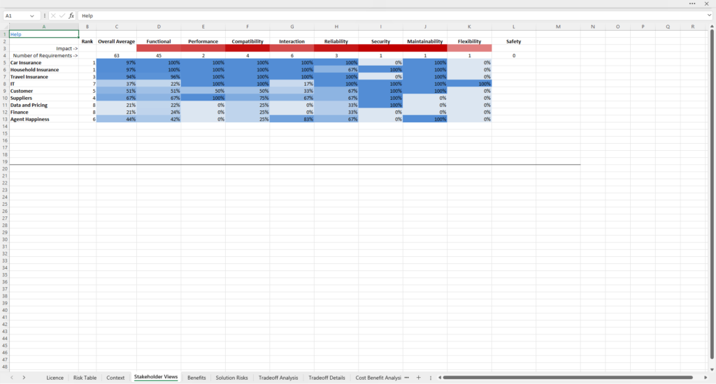
It is a colour map, where the strength of the colour reflects the strength of the association between a stakeholder (each stakeholder occupies a row in the table) and a quality characteristic in the Quality Model. Row 3 shows the relative strength of impact for each quality characteristic – the stronger the colour, the greater the impact. Row 4 shows how many requirements there are classified under each quality characteristic, and how many there are altogether (63 in this example). The numeric values in the table indicate the percentage of the requirements for that quality characteristic in which the stakeholder has an interest.
The table can be read in a number of different ways, each useful in establishing that Part 1 has produced a coherent and complete view of the high-level requirements. Reading across the table, row by row, allows the user to see which quality characteristics are of the greatest and least importance to each stakeholder. Reading vertically from the first column to the last, the user can see which stakeholders are most, or least interested in each quality characteristic. One might expect, for example, for end user stakeholders to be most interested in functionality and usability (as we see in this example with the product teams). Whereas operations might be most interested in security, reliability, efficiency and sustainability (as we see with IT here, since they have to keep the system or service in operation safely and reliably). The architect / designer can review this and consider whether the outcome as shown in this table is as he or she might expect. If not, it might suggest that there are either missing requirements, or that there is a misalignment of project priorities.
Columns B and C show the overall level of interest each stakeholder has across the entire set of requirements, by percentage and their position in the rank order of interest (from first to last) respectively. So it is easy to see which stakeholders are most and least interested overall in the system or service. You would expect to see an alignment between this and the most important stakeholders. In this example, we can see that this is a set of requirements oriented towards the needs of product departments, and not their customers.