This is where the team gets to see the final output of the SARM process. Ideally, it is part of a collaborative workshop that has just completed the previous activity, and can be viewed, considered and discussed by the project team and their most important stakeholders. Because it is an exploration of the outcome, each instance of this activity is likely to be different, and follow a different course. Questions will be asked, and many of the answers are likely to be found on the ‘Tradeoff Analysis’ tab of the SARM spreadsheet tool.
An example of this is given below:

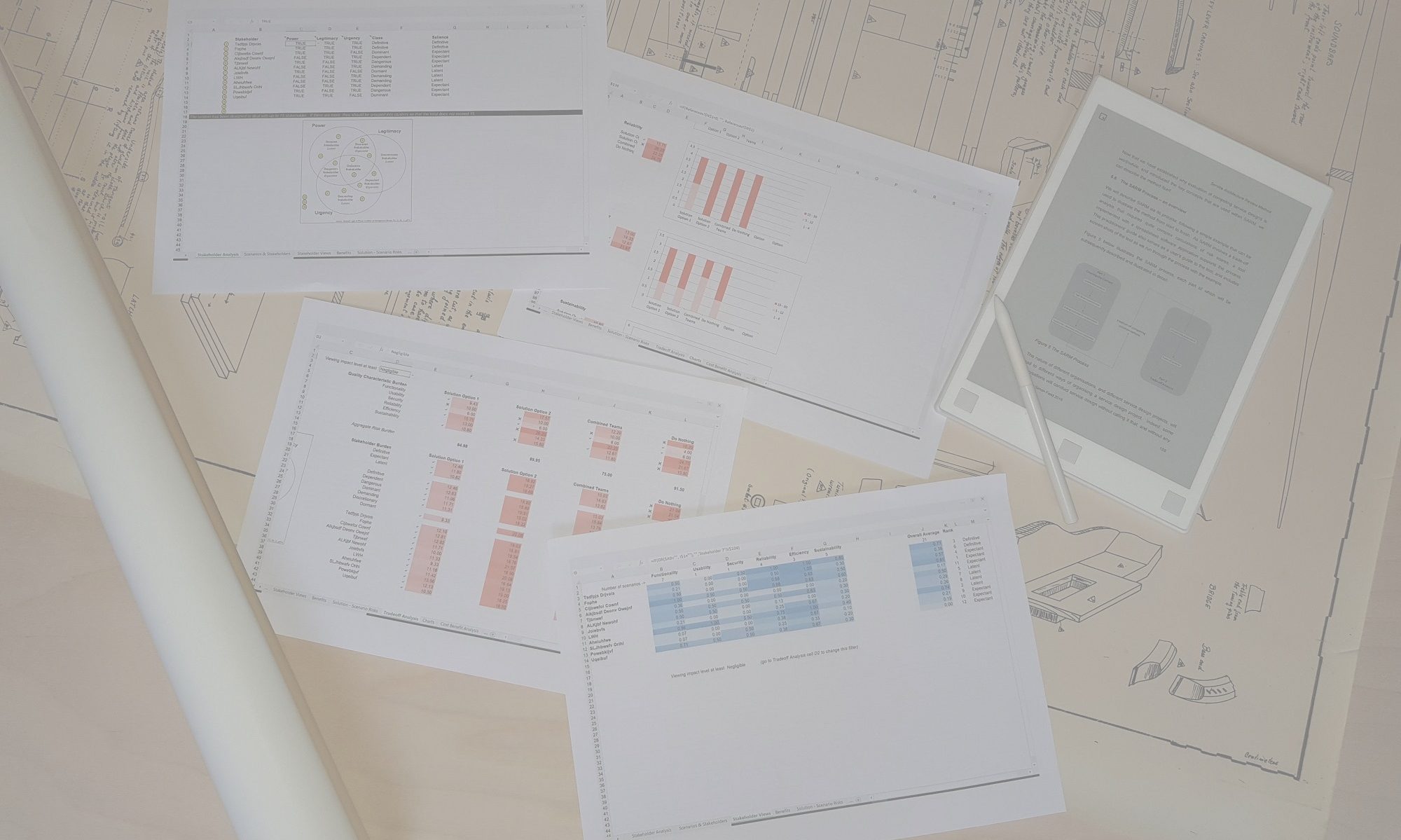
In this example, four competing solution options are being evaluated. The top part of the worksheet shows an analysis of the risks associated with each option from the different perspectives of the quality characteristics and the stakeholders.
Quality Characteristic perspectives
The first section considers the quality characteristics of the Quality Model. The numbers represent the average risk score for all the requirements that fall within each quality characteristic. These vary by solution option, and a stronger colour, and higher score, indicates a higher average risk exposure score. A green tick next to a score indicates that this option has the lowest risk score in its row, while a red cross indicates the highest risk score in the row.
The Aggregate Risk Burden shows a sum of the average risk scores for each solution option. This might be a useful overall indicator, but it should not be taken as a simple ‘total score’ which determines ‘the winners and losers’. You should be aware that there is no weighting of the scores for each quality characteristic, so the total is just a simple addition of the scores. It therefore assumes that Functionality is of equal importance as Sustainability, even though they may in reality be significantly different, and be made up of a different number of scenarios.
Another consideration is that a solution option that exhibits an area of high risk should not necessarily be ruled out on that account. It could be, for example, that the risks in that area could be mitigated by a small design change, or by some operational aspect of the way the solution or service will be implemented.
Stakeholder perspectives
Below the risk scores by quality characteristic you can find similar information but showing the perspectives of the individual stakeholders. This might help you determine whether any one solution might favour one group of stakeholders at the expense of others. And an exploration of this part of the spreadsheet might either reinforce your preliminary conclusions about the suitability of the different solution options, or cause you to reconsider your preferences.
Individual scenarios
The lower part of this spreadsheet shows a similar representation of risk scores, but for each individual requirement. This can be useful if you need to ‘drill down’ to find out what was causing a poor aggregate risk score when examining them by quality characteristic or stakeholder group.
Distribution of risk scores
The team conducting the analysis might also wish to explore the next two tabs, ‘Tradeoff Details’ and Charts’, to understand how certain aggregate risks are made up. These show a breakdown of risk scores by sub-characteristic and the distribution of risk scores for each solution by quality characteristic respectively, and allow the team to see whether two similar risk scores may be constituted very differently. For example, one average score may be made up of a number of similarly scored risks, while another similar average score may consist of some very low risks and some very high risks. Understanding the distribution and make-up of risk scores that might be hidden within an average score can help the team understand the true risk profile as they seek to select a preferred solution and devise ways to further mitigate residual risks.
At this stage, the evaluation team is now in an excellent position to determine which solution option or options are preferred for implementation or, in the case of an analysis of an existing architecture, understand the areas of risk most in need of attention. It is unlikely that any one solution represents a perfect solution, as all practical solutions are likely to contain compromises and trade-offs among ASRs and between quality characteristics. Following this workshop, the team are now better informed about the various trade-offs involved here, and they can select a recommended architecture or design or make changes to an existing architecture knowing the outstanding risks that they will have to manage in the future.
Telling the analysis story
It is also suggested that, whilst an analysis of heat maps and numbers can shed light on the risk landscape, it might be a good idea to create a story out of the trade-off analysis. Many people, such as executives or project steering committee members or senior stakeholders, are more likely to respond to being told a narrative that explains why one solution is preferred, and why none of them is perfect, than being shown a spreadsheet full of numbers and colours. So whilst the spreadsheet holds the details, it also contains the source of a story, and it is this story that should be sought out and articulated to explain the team’s decision or recommendation.